Product Website
Web interface Design
Research
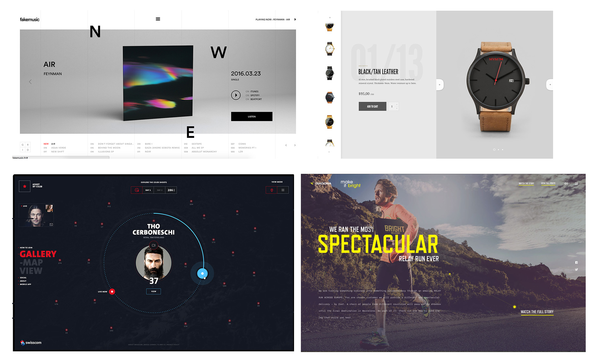
The research started of with referring to various product websites available and creating a basic flow of user journey. The user journey mainly includes product surfing, customization and purchase of the product.
Brainstorming and Ideation
What should the landing page focus on?
How can the purchase made easy?
Infographs for main Product feature.
Vivid Colors to direct the user's navigational flow.
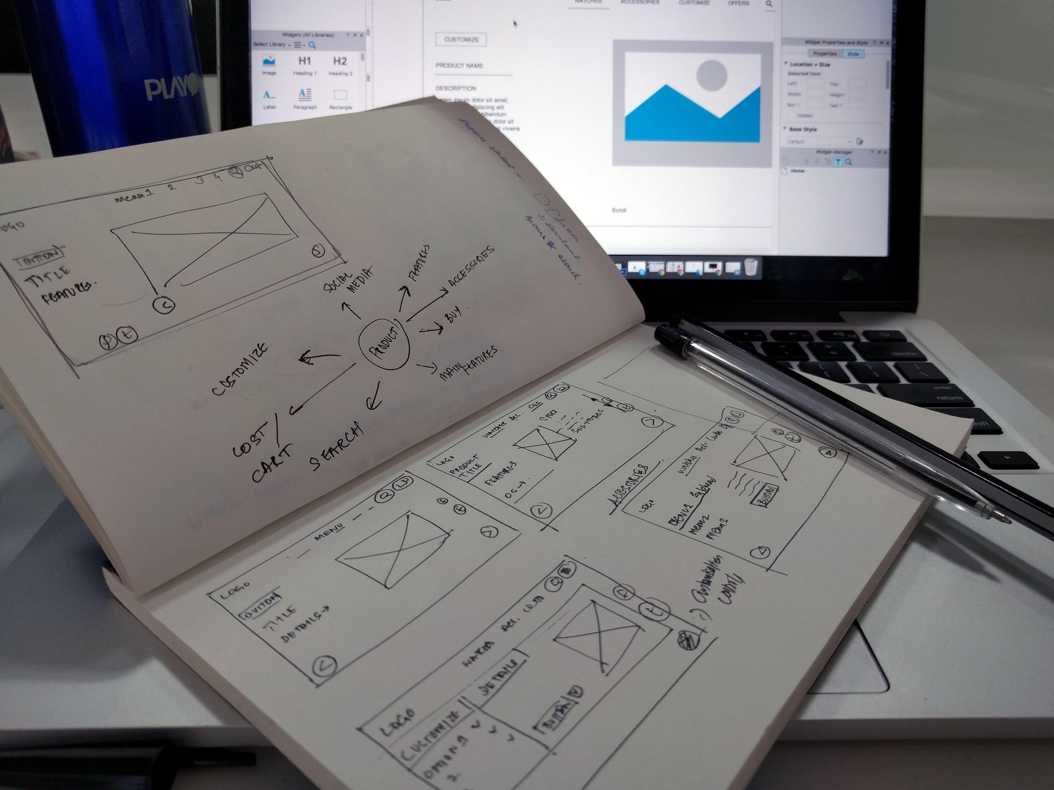
Wireframing
After the ideation and sketching, wireframe and flows were created using Axure RP Pro tool.
Visual Design
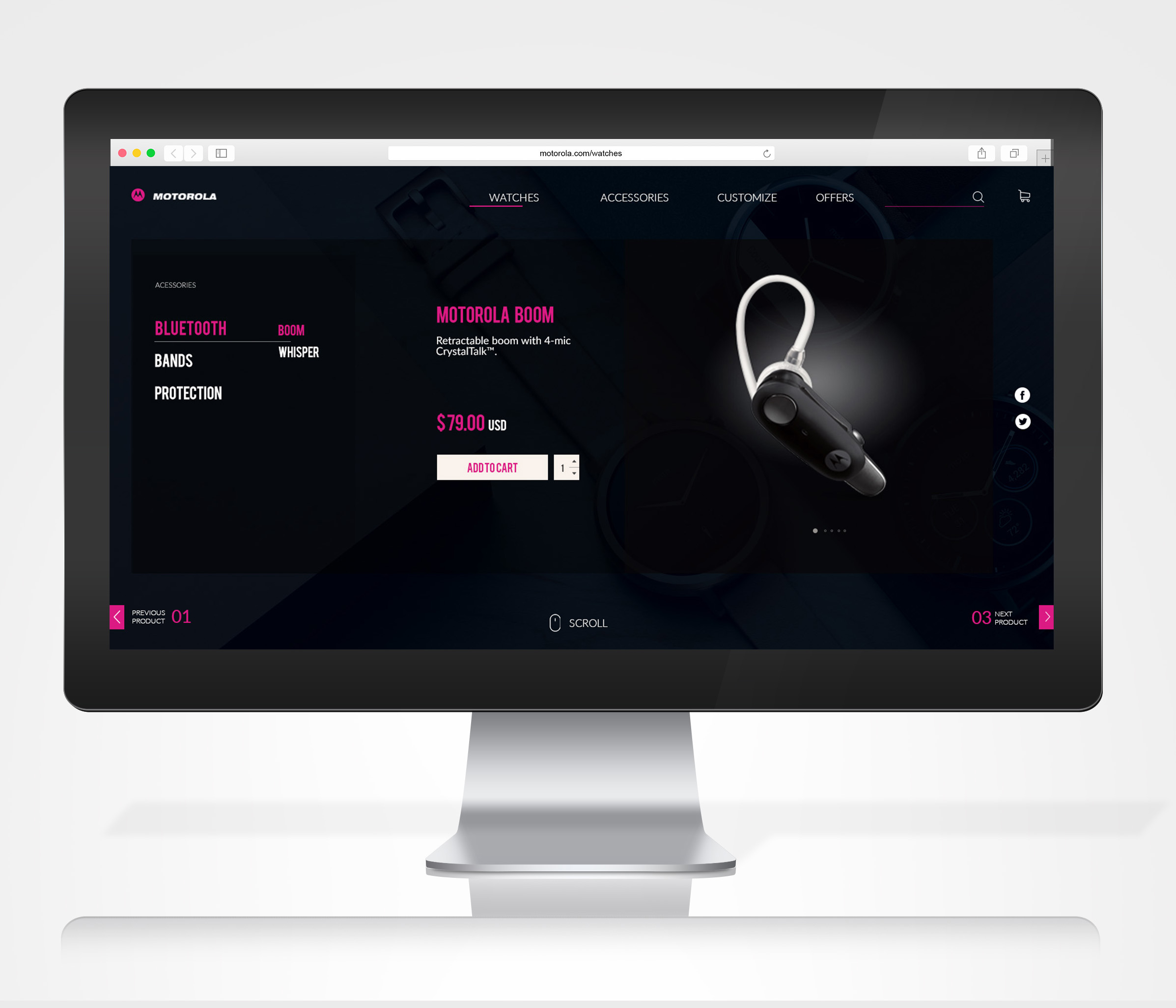
The process of creating visual Design starts with deciding on the color theme and elements of design. For Motorola, I decided to use the bright pink used in one of their logos to retain brand identity and dark blue of the same temperature creating a perfect contrast to direct user attention. Elements of design were kept geometrical, sleek and modern to represent the personality of the moto smart watches thereby giving a rich classic and stylish outlook.
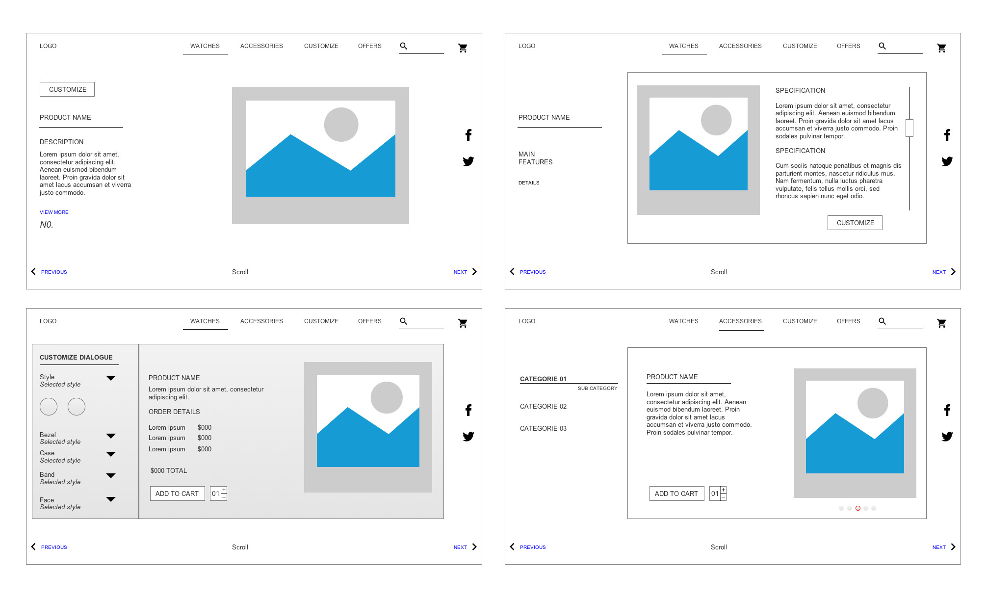
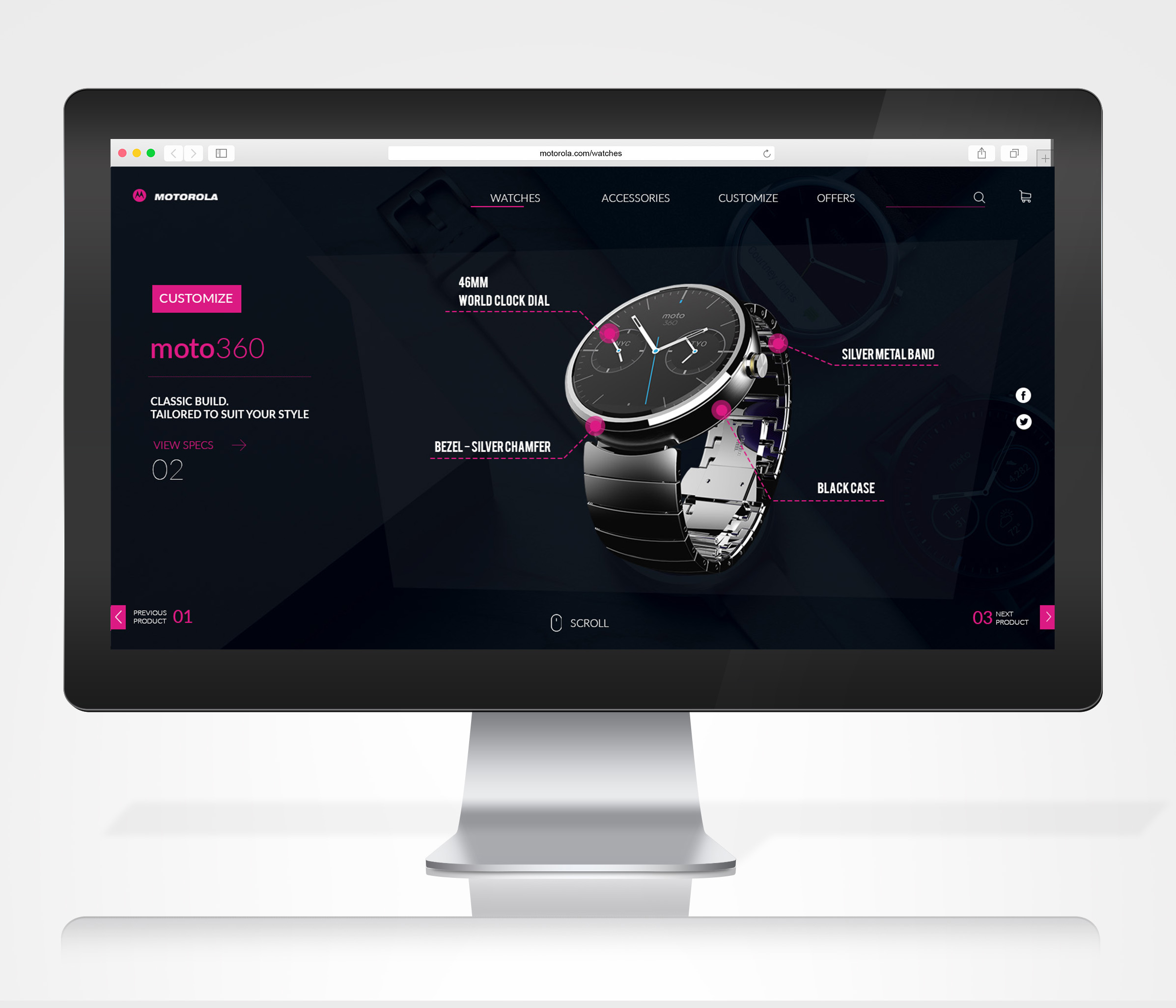
Landing Page
The landing page was designed to display the main product features and the navigation to other product range easily.
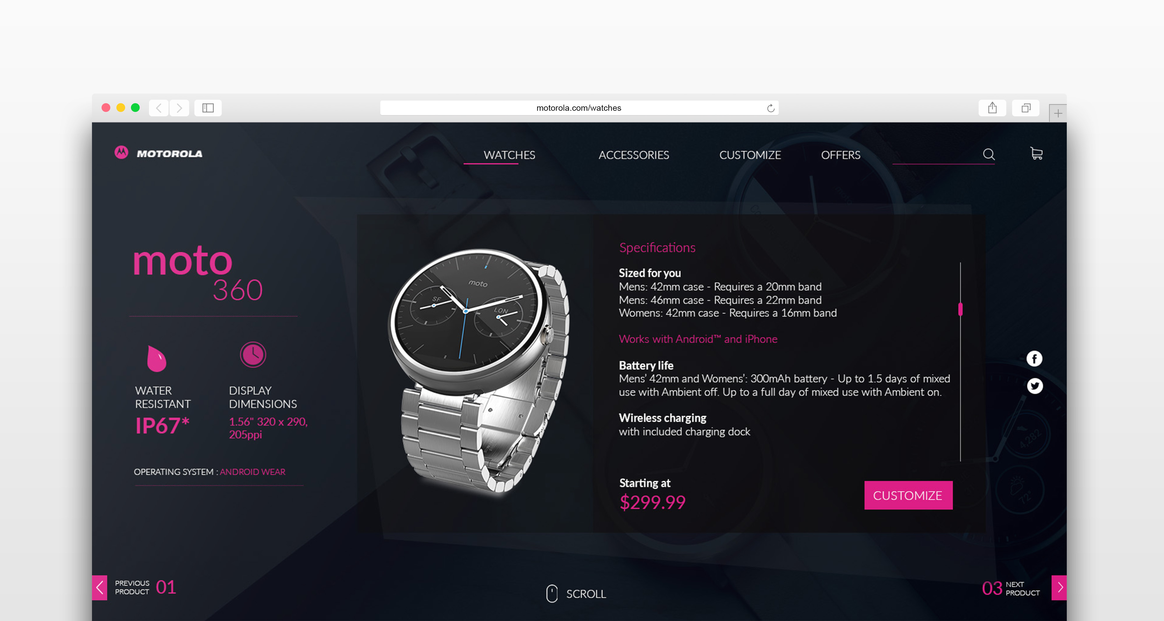
Product features screen
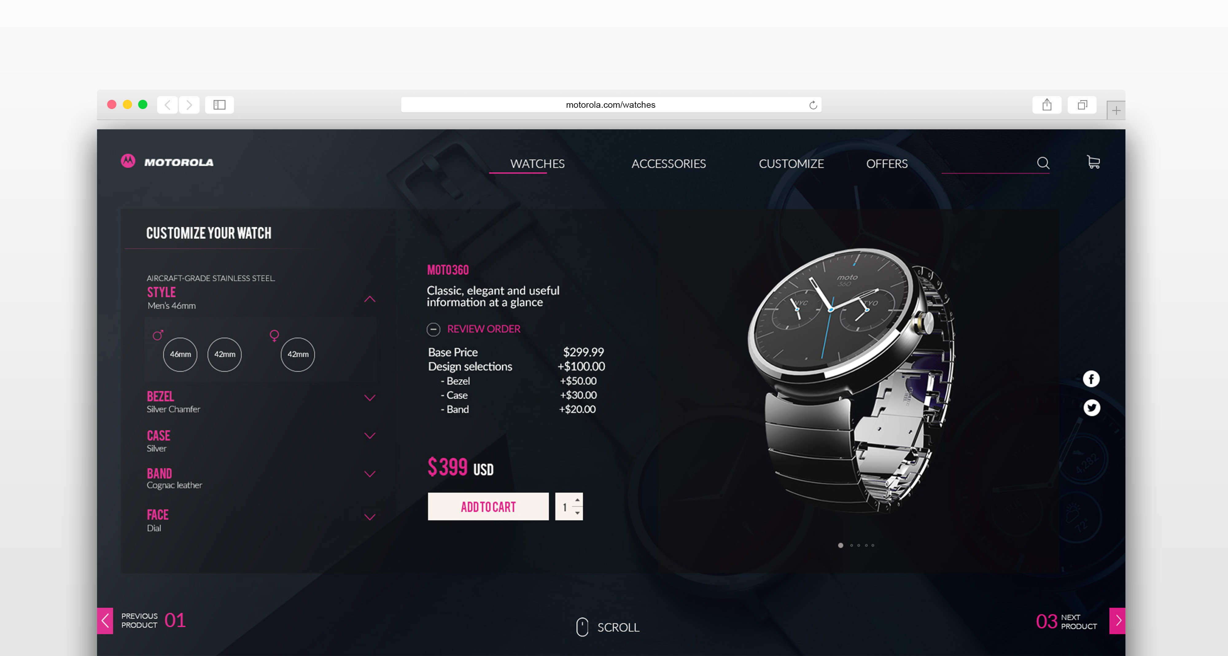
Customisation screen
Accessories screen